If you’ve ever sent a file to print and heard “We need bleeds” or “Your safe area is too tight,” you’re not alone. These are standard print terms—but they’re easy to mix up. Keep reading for more information on important design terms you should be familiar with so your physical marketing stays on brand.
1) Crop marks (or “crops”)
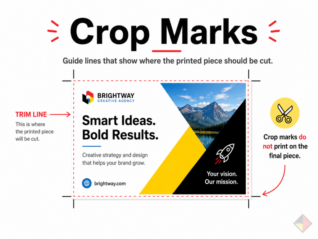
Crop marks are little lines placed outside your design that show the printer where the final piece should be cut. They don’t print on the finished product—they’re just cutting guides.
Without crops, it’s harder to trim accurately to the correct finished size.
2) Bleed
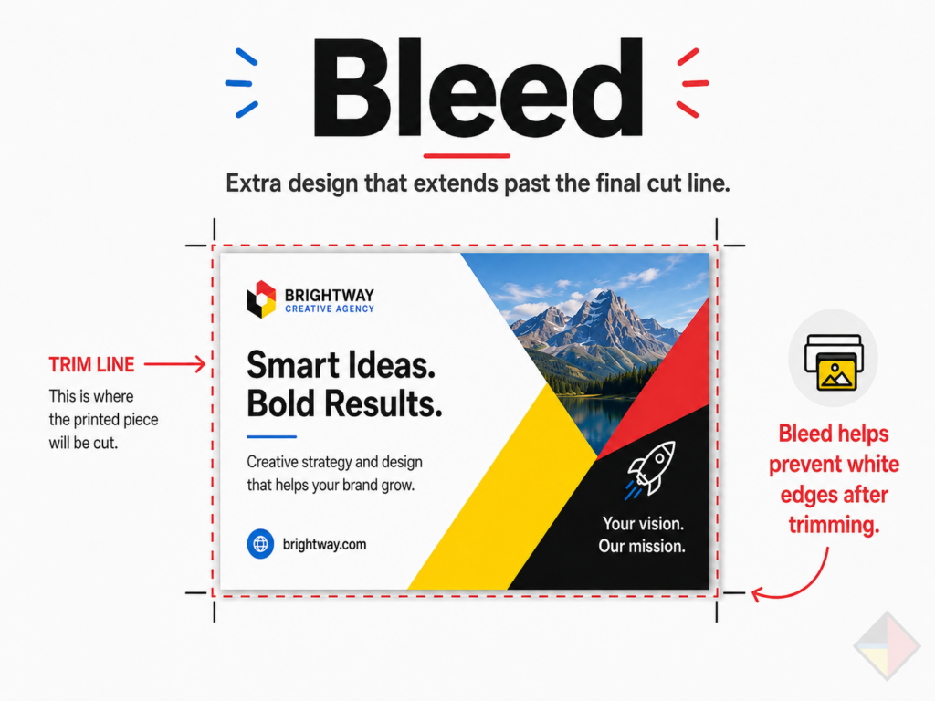
Bleed is extra design that extends past the final cut line (usually 0.125″ / 1/8″ on each side for many print pieces). If your background color or image goes all the way to the edge, you need bleed.
Cutting isn’t perfect to the pixel. Bleed prevents thin white edges from showing after trimming.
3) Margins (safe area)
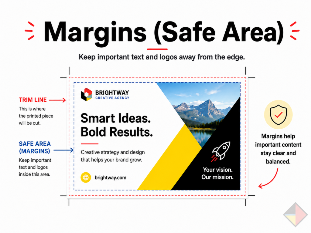
Margins (often called the safe area) are the space you keep between important content (text, logos) and the edge of the finished piece.
Margins keeps key elements from looking cramped—or getting too close to the trim where they can feel off-center.
4) Trim size (final size)
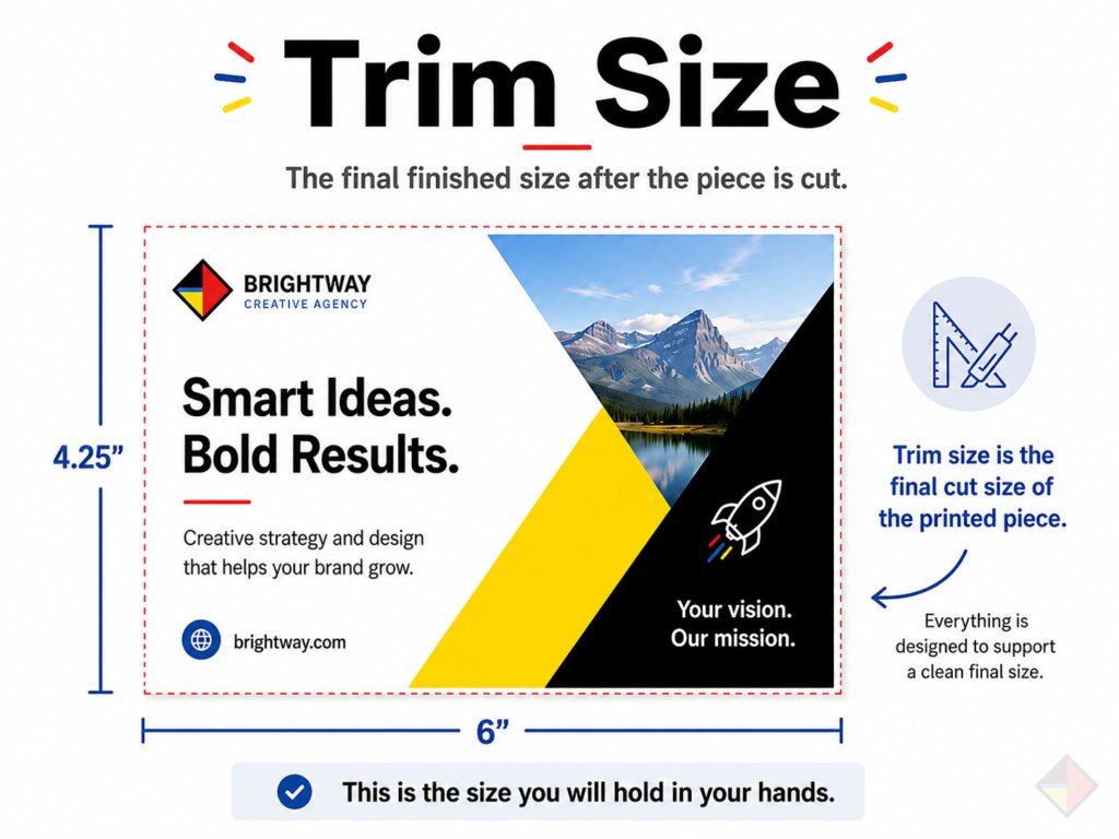
Trim size is the final, finished size of the printed piece after it’s cut (example: 8.5″ x 11″ flyer, 24″ x 36″ poster).
This is the size you want to design for—everything else (bleeds, crops) supports getting to this final size cleanly.
5) Resolution (DPI)
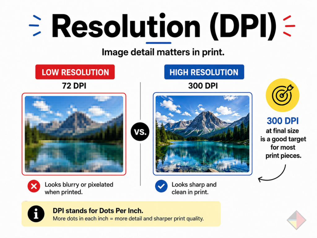
Resolution is how detailed your image is for printing, usually measured in DPI (dots per inch). For most print pieces, 300 DPI at final size is a good target. Large-format signage can vary depending on viewing distance.
Low-resolution (low DPI) images look blurry or pixelated when printed—especially on large signage.
6) CMYK vs RGB vs PMS (color settings)
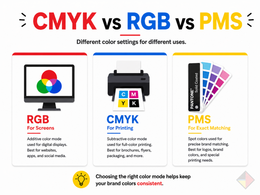
RGB (Red, Green, Blue) color is for screens (web, phones, monitors). CMYK (Cyan, Magenta, Yellow, Black) color is for printing. PMS (Pantone Matching System) is a standardized color system used when you need even tighter color consistency—often for logos, brand colors, and certain signage/print applications.
Colors can shift when a file moves between RGB, CMYK, and PMS. If your brand color needs to print consistently, you want proper print color setup—especially for logos and branded signage.
How NWPC helps your designs look great in print while staying aligned with your brand identity.
Your business may have a great design idea, but print and signage has a few rules that can make or break the final result. That’s where our team comes in.
At NWPC Marketing Solutions, we work with you to:
- Clean up and “spruce up” designs so they look more polished and professional
- Make sure files are print-ready (correct trim size, bleeds, margins, and exports)
- Help your layouts read well at real-world size (especially for signage and wide-format)
- Keep everything aligned with your brand identity—logos, colors, typography, and consistency across locations and materials
Whether it’s a flyer, banner, window graphic, wall wrap, or a full signage package, we help make sure what you approve on screen is what you’re proud to install in the real world.