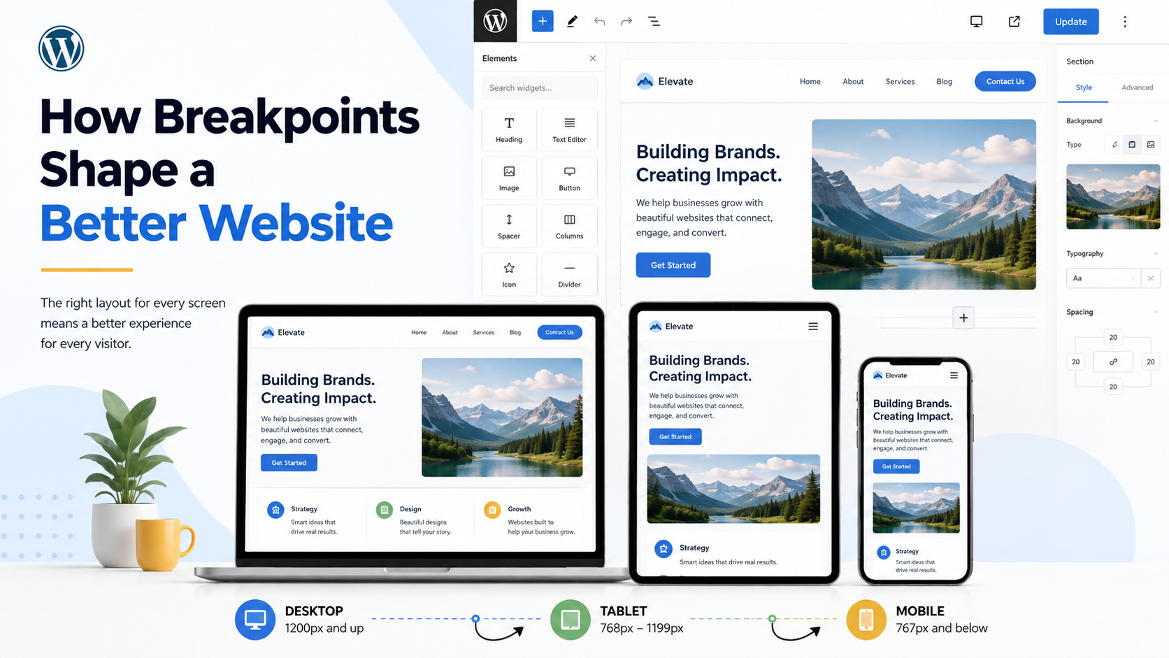
We Don’t Just Shrink the Desktop Version
A strong mobile site is not just a smaller desktop site. Our developers adjust layouts so content remains easy to read, navigate, and use across phones, tablets, laptops, and desktop screens.
The goal is simple: every version of the site should feel like it was designed for that screen.
We Test More Than Just Desktop and Mobile
Responsive development is not about checking two screen sizes and calling it done. It’s important to test the spaces between content sections to see where layouts begin to feel crowded or awkward. That is where breakpoints are adjusted.
These details are easy to miss, but they have a big impact on how polished a website feels.
We Build Responsive WordPress Sites Intentionally
WordPress gives developers responsive tools, but those tools still need to be used correctly.
Our team reviews each page and fine-tunes how sections behave across different screen sizes rather than relying only on default settings.
That means your website is not simply “mobile-friendly.” It is built to provide a strong experience across the full range of devices your visitors actually use.
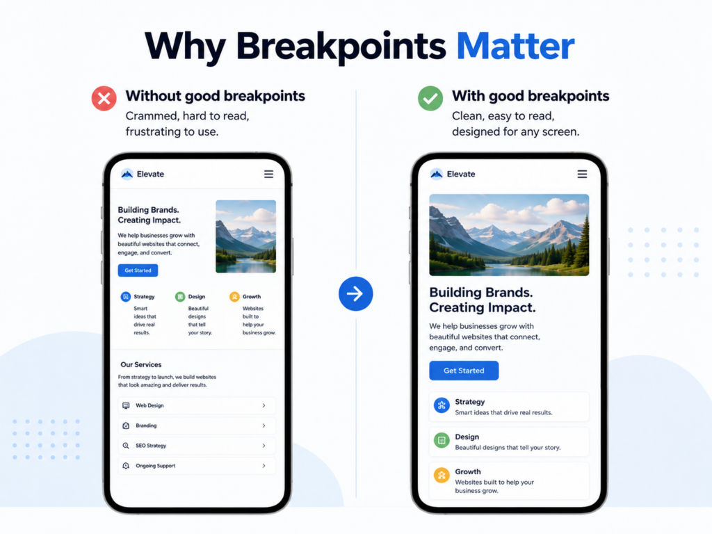
Most visitors will never know where a breakpoint is set – they just know whether your website feels easy to use.
When responsive development is done well, visitors can find information faster, navigate more easily, and take action without fighting the layout. This helps your business look more professional and gives users fewer reasons to leave.
Built to Work Everywhere
At NWPC, responsive development is part of the build process — not something we tack on at the end.
We plan, test, and refine your website across different screen sizes so it looks sharp and works smoothly wherever your customers find you.
Need a website built with that level of attention? Talk to NWPC about your next web project.