Most Signs Don’t Fail Because They’re Ugly
They fail because they’re hard to read.
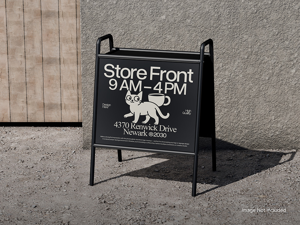
Your sign has a short window to do its job—especially if someone is driving, walking past, or looking through a windshield with sunlight glare.
So here’s a simple rule we use:
The 3‑Second Sign Test
If a stranger can’t understand your sign in about 3 seconds, it’s not doing its job.
In those 3 seconds, your sign should answer:
- Who are you? (business name / recognizable brand)
- What do you do? (simple category, not a slogan)
- What should I do next? (optional, but helpful: call, visit, enter, etc.)
If your sign needs paragraphs, punctuation, or a second glance… it’s asking too much.
6 Fixes That Make Signs Work Better
1) Use fewer words (seriously)
Most signage copy is written like a website. Signs aren’t websites.
Keep it short. Big type beats more words every time.
2) Make the “what you do” obvious
A clever tagline is fine, but it’s not the same as clarity.
Better:
“Roofing & Repairs”
than:
“Protecting What Matters Most”
3) Build a clear hierarchy
Your viewer’s eyes should hit the message in this order:
- Name / brand
- Service
- Contact / next step
If everything is the same size, nothing is important.
4) Contrast wins (design doesn’t matter if nobody can read it)
Low contrast looks “modern” right up until… nobody can see it.
If you have to squint, it’s a no.
5) Think about the real viewing distance
Ask: how far away is someone when they first need this information?
If it’s a roadside sign or storefront people pass at speed, tiny text is wasted text.
6) Placement beats perfection
A perfectly designed sign in the wrong spot still loses.
Make sure it’s:
- visible from the approach angle people actually use
- not blocked by landscaping, poles, tinted glass, or reflections
- readable in daytime + nighttime conditions (if applicable)
Quick Self-Audit (2 Minutes)
Grab a photo of your sign from the road / parking lot / sidewalk and answer:
- Can I read it on my phone screen at a normal size?
- Can I tell what you do without guessing?
- Is your phone number or web address actually readable?
- Is there anything on the sign that doesn’t need to be there?
- Would a first-time customer know where to go next?
If any answers are “no,” the sign can be improved—usually without making it more complicated.
Common “Well-Meaning” Mistakes
- Listing every service you offer
- Using a tagline instead of a clear category
- Putting a full URL, phone number, and social handles in 8pt type
- Designing for a computer screen instead of real life
Want a Fast Opinion?
Send us a photo of your sign (storefront, lobby, vehicle, jobsite sign—anything). We’ll give you one clear improvement you can make right away.
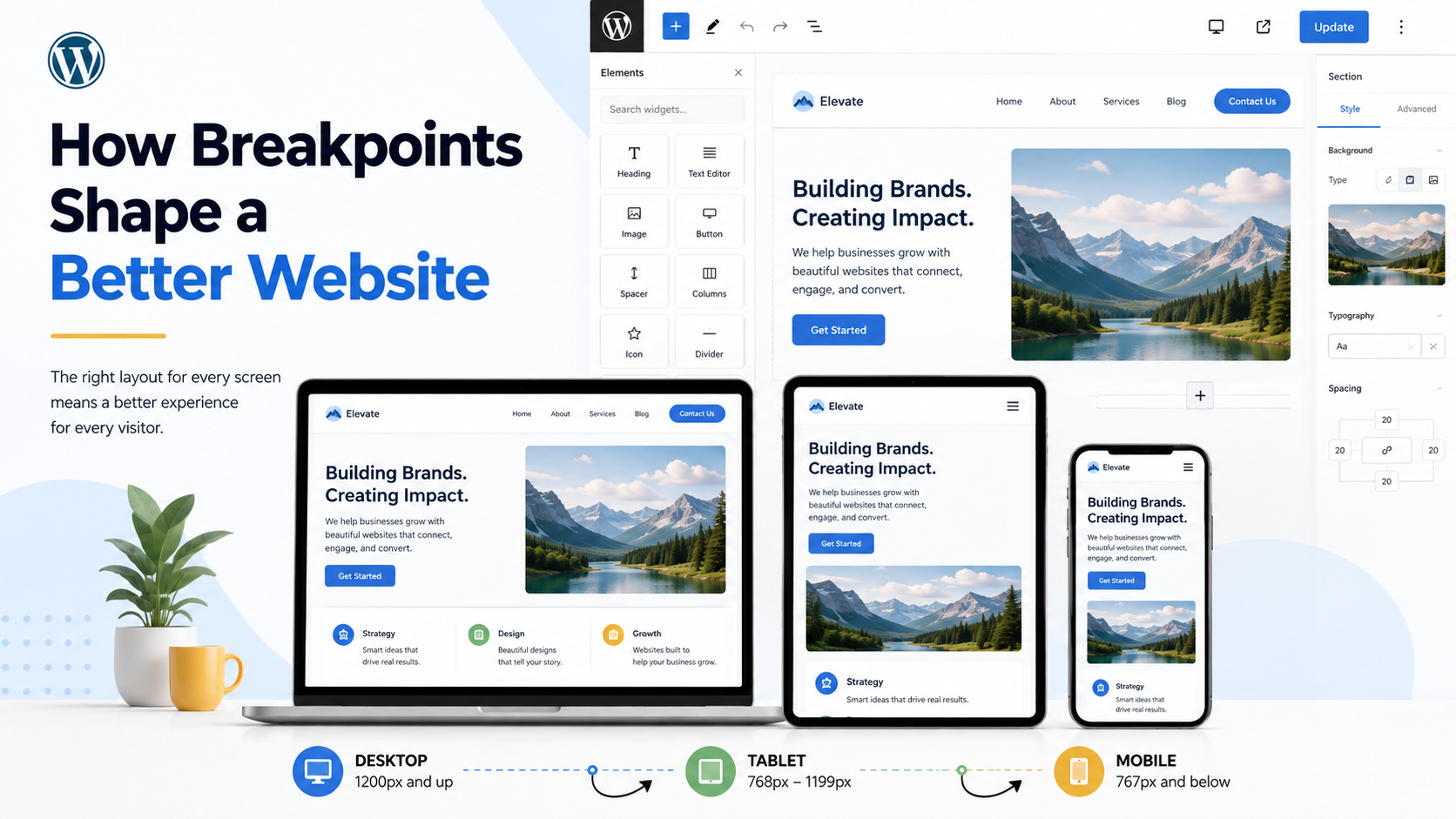
- How Our Developers Use Breakpoints to Build Better Websites
- Custom Embroidered Patches on Trucker Hats
- Embroidery vs Heat Transfers vs Screen Printing: What’s Best for Branded Apparel?
- 10×10 Expo Booth Kits for Trade Shows | Custom Booth Displays by NWPC
- Weekly Marketing Roundup (5/22): Website SEO Wins, Door Vinyl, Brand Fonts, AI Visibility & Uniform Fabrics